Making Better Meetings ... maybe
To say that I attend a lot of meetings is a bit of an understatement. However, as a manager that is part of my job and I accept that it is something I need to do.
What I have been trying to do at my office is lead more effective meetings, but also to encourage my colleagues to have more effective meetings as well.
It's been challenging as the organization I work for is large and all I can do is lead by example with the meetings that I am in.
Until now ... maybe
I read an article on LinkedIn titled Tired of wasting time in meetings? Try this and there were several suggestions for better meetings some of which I already knew:
- Define the purpose of the meeting
- Define the outcome of the meeting
- Have a timed agenda and someone in charge
And others that I didn't:
- Facts - not opinions!
- Keep people on-point. (Only talk about matters relating to their job)
I think that number 4 is a key idea for any meeting (that isn't a brainstorming meeting) but number 5 is a bit too much. Keeping people on point is an important aspect to any meeeting, but only allowing people to talk about matters related to their job ... what is the dividing line between 'my job' and 'not my job'?
This seems like it wouldn't actually have the intended outcome. I think people who are already quite will be encouraged to stay quite as the topic isn't related to their job (even if it might be) and those that talk too much already will assume that everything is related to their job so they will still contribute inappropriately.
I think that point 5 is much better when restated as:
- Keep people on-point, only talk about the current agenda item
The article did include a nice diagram that you can download (need to provide an email address first).
Success through failure
One of my goals for 2017 has been to read more. According to Pocket I have been in the top 1% of 'pockters' in both 2015 and 2016, but even if that's true (and I'm not entirely convinced it isn't just marketing stuff) what I'm reading are web articles, some long form, but mostly short form articles.
This isn't the kind of reading I want to focus on in 2017. I've got a list of (mostly) science fiction books I'm planning on reading this year.
I'm also listening to audio books through Audible during my commute to work. Those books are a little more varied in their content so far, and exclusively non-fiction.
But why does this matter? As I do I was reading an article on Isaac Asimov entitled Isaac Asimov: How to Never Run Out of Ideas Again – Personal Growth – Medium.
From the article 4 points really struck me:
- Read widely. Follow your curiosity. Never stop investing in yourself.
- Diversity is insurance of the mind.
- We fail. We struggle. And that is why we succeed.
- After all, never having ideas means never having to fail.
Although I had planned on reading more before having read the article, after reading it I'm even more dedicated to making sure I read as much as I can this year.
The last 2 points are also something I've been trying to work on. One of the reasons for this site is so I can showcase the ways in which I fail and what I am able to learn from those 'failures'.
The ideas that failure and struggle lead directly to success is something I'd never really connected, but I can see the connection between them now.
I like the idea that Isaac Asimov failed at things, but that they didn't prevent him from accomplishing those (and other) things.
This article really helped crystallize an idea that I've had a hard time putting into words ...
Failing only happens when you don't try. Trying to do a thing and not achieving that thing is not failing, it's simply a different result than you expected. The success is in the trying.
I don't know if these are the best words, but as I'm learning, the success is in the trying, not in the perfection of the result.
Struggle determines success
On Sundays mornings I wake up pretty early, make myself some coffee and read through all of the interesting articles I came across during the week (usually from Twitter).
Last weekend I came across an article, You probably know to ask yourself, “What do I want?” Here’s a way better question
I was struck by several passages in the article:
If you find yourself wanting something month after month, year after year, yet nothing happens and you never come any closer to it, then maybe what you actually want is a fantasy, an idealization, an image and a false promise. Maybe what you want isn’t what you want, you just enjoy wanting. Maybe you don’t actually want it at all.
I wanted the reward and not the struggle. I wanted the result and not the process. I was in love not with the fight but only the victory. And life doesn’t work that way.
This is the most simple and basic component of life: our struggles determine our successes. So choose your struggles wisely, my friend.
When I was younger I wanted to be many things, a Physicist, an Architect, an Engineer, a Professor ... but none of those things ever got any closer. I'd be really engaged in the ideas of one of these for weeks or months at a time.
I remember being so enamoured with the idea of Civil Engineering I convinced my parents to get me a drafting board that I had in my room and I used to 'design' a prototype of a Martian Habitat.
But, as soon as I got bored I would move onto something else. From Physics to Architecture to Engineering and back to Physics. I would always stop when it either got too hard OR something else looked more interesting.
I was always awed by my peers that could stay laser focused on a single hobby or dream job and was amazed at the amount of sacrifice they would be willing to make in order to achieve their goals.
It wasn't until I got to college when I started to see what I needed to sacrifice in order to get ahead.
Parties on the weekend. Not for me ... I had a full time job and was a full time student. I would hang with friends when I could, but I was mostly at the library studying, or at work studying or maybe getting a little bit of sleep.
I suddenly became laser focused like the people I knew in high school. I had a single goal and that was to graduate and go onto graduate school so I could get a PhD in economics.
The PhD didn't happen, and in the following years I felt like I did in high school ... becoming very interested in a 'thing' and then moving on from it because I'd get bored.
Then I stumbled into the Healthcare Industry and it all came back. An ability to be laser focused on new and interesting things. Wanting (maybe needing) to learn everything I could about Healthcare.
It's been more than 8 years since I started on my journey, and I've struggled every time I've started to learn a new aspect of the industry, or just an aspect of a new job that I had started.
And that's when the final passage in the article really hit me like a ton of bricks:
This is the most simple and basic component of life: our struggles determine our successes. So choose your struggles wisely, my friend.
It truly is the struggle that determines the success. I've struggled mightily while working in healthcare, but those struggles have lead to the most fulfilling and successful career I could have hoped for.
Communication and Checklists
I've been thinking about communication ... a lot. How well people communicate (or don't communicate) is what drives nearly every problem, either at work or at home. Communication is essential to a feeling of team which can help to avoid communication problems in the first place. Once you feel like you are on a team, I think it's easier to engage in communication because you feel more comfortable asking questions, posing challenges when needed, and generally being happier with your surroundings.
I'm almost finished with Atul Gawande's book The Checklist Manifesto and what struck me the most about it was the fact that checklists used by pilots, construction crews, and surgeons all had one thing in common. They forced communication amongst disparate people helping to start the formation of bonds that lead to a team.
Whether constructing a 32 floor high rise building, flying a 747 or performing open heart surgery, these are all complex problems and they all have checklists.
The use of these checklists help the practitioners focus on what's important by using the checklist to remind them of what needs to be done but is easily forgotten.
All of this is interesting, but you can get to a 'so what' or 'and ...' point.
While reading Data silos holding back healthcare breakthroughs, outcomes this line caught my attention:
However, the MIT researchers contend that the health data divide can be narrowed by creating a culture of collaboration between clinicians and data scientists
Here's the 'so what' point of all of this. Using Big Data to help patients should be what the healthcare industry is focusing on. But this is difficult because Clinicians and Data Scientists don't always have the vocabulary nor the incentives to collaborate in a meaningful way that leads to improved patient outcomes.
Could check lists for implementing Big Data at various types and sizes of organizations help? I think so, because at the very least, it could start the necessary conversations needed to engender a sense of team between Clinicians and Data Scientists which can be sorely lacking in many institutions.
Big Data and Healthcare - thoughts
Healthcare Big Data Success Starts with the Right Questions
The last major piece of the puzzle is the ability to pick projects that can bear fruit quickly, Ibrahim added, in order to jumpstart enthusiasm and secure widespread support.
Healthcare Big Data Success Starts with the Right Questions
Moving from measurement to management – and from management to improvement – was the next challenge, he added.
Healthcare Big Data Success Starts with the Right Questions
Each question builds upon the previous answer to create a comprehensive portrait of how data flows throughout a segment of the organization. Ibrahim paraphrased the survey like so:
• Do we have the data and analytics to connect to the important organizations in each of these three domains?
• If we have the data, is it integrated in a meaningful way? Can we look at that data and tell meaningful stories about what is happening, where it’s happening, and why it’s happening?
• Even if we have the data and it’s integrated meaningfully and we can start to tell that story, do we apply some statistical methodology to the data where we aggregate and report on it?
• If we have the data, and it can tell us a story, and we use good analytics methodology, are we able to present it in an understandable way to all our stakeholders, from the front-line clinician all the way up to the chief executive?
• Are the analytics really meaningful? Does the information help to make decisions? Is it rich enough that we can really figure out why something is happening?
• Lastly, even if we have accomplished all these other goals, can we deliver the information in a timely fashion to the people who need this data to do their jobs?
Presenting Data - Referee Crew Calls in the NFL
One of the great things about computers is their ability to take tabular data and turn them into pictures that are easier to interpret. I'm always amazed when given the opportunity to show data as a picture, more people don't jump at the chance.
For example, this piece on ESPN regarding the difference in officiating crews and their calls has some great data in it regarding how different officiating crews call games.
One thing I find a bit disconcerting is:
- ~~One of the rows is missing data so that row looks 'odd' in the context of the story and makes it look like the writer missed a big thing ... they didn't~~ (it's since been fixed)
- This tabular format is just begging to be displayed as a picture.
Perhaps the issue here is that the author didn't know how to best visualize the data to make his story, but I'm going to help him out.
If we start from the underlying premise that not all officiating crews call games in the same way, we want to see in what ways they differ.
The data below is a reproduction of the table from the article:
REFEREE DEF. OFFSIDE ENCROACH FALSE START NEUTRAL ZONE TOTAL
Triplette, Jeff 39 2 34 6 81 Anderson, Walt 12 2 39 10 63 Blakeman, Clete 13 2 41 7 63 Hussey, John 10 3 42 3 58 Cheffers, Cartlon 22 0 31 3 56 Corrente, Tony 14 1 31 8 54 Steratore, Gene 19 1 29 5 54 Torbert, Ronald 9 4 31 7 51 Allen, Brad 15 1 28 6 50 McAulay, Terry 10 4 23 12 49 Vinovich, Bill 8 7 29 5 49 Morelli, Peter 12 3 24 9 48 Boger, Jerome 11 3 27 6 47 Wrolstad, Craig 9 1 31 5 46 Hochuli, Ed 5 2 33 4 44 Coleman, Walt 9 2 25 4 40 Parry, John 7 5 20 6 38
The author points out:
Jeff Triplette's crew has called a combined 81 such penalties -- 18 more than the next-highest crew and more than twice the amount of two others
The author goes on to talk about his interview with Mike Pereira (who happens to be ~~pimping~~ promoting his new book).
While the table above is helpful it's not an image that you can look at and ask, "Man, what the heck is going on?" There is a visceral aspect to it that says, something is wrong here ... but I can't really be sure about what it is.
Let's sum up the defensive penalties (Defensive Offsides, Encroachment, and Neutral Zone Infractions) and see what the table looks like:
REFEREE DEF Total OFF Total TOTAL
Triplette, Jeff 47 34 81 Anderson, Walt 24 39 63 Blakeman, Clete 22 41 63 Hussey, John 16 42 58 Cheffers, Cartlon 25 31 56 Corrente, Tony 23 31 54 Steratore, Gene 25 29 54 Torbert, Ronald 20 31 51 Allen, Brad 22 28 50 McAulay, Terry 26 23 49 Vinovich, Bill 20 29 49 Morelli, Peter 24 24 48 Boger, Jerome 20 27 47 Wrolstad, Craig 15 31 46 Hochuli, Ed 11 33 44 Coleman, Walt 15 25 40 Parry, John 18 20 38
Now we can see what might actually be going on, but it's still a bit hard for those visual people. If we take this data and then generate a scatter plot we might have a picture to show us the issue. Something like this:
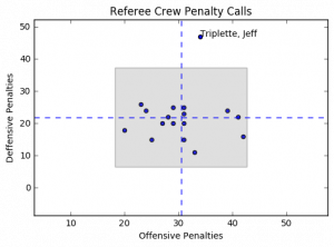
The horizontal dashed blue lines represent the average defensive calls per crew while the vertical dashed blue line represents the average offensive calls per crew. The gray box represents the area containing plus/minus 2 standard deviations from the mean for both offensive and defensive penalty calls.
Notice anything? Yeah, me too. Jeff Triplette's crew is so far out of range for defensive penalties it's like they're watching a different game, or reading from a different play book.
What I'd really like to be able to do is this same analysis but on a game by game basis. I don't think this would really change the way that Jeff Triplette and his crew call games, but it may point out some other inconsistencies that are worth exploring.
Code for this project can be found on my GitHub Repo
Rogue One - A Star Wars Story
Rogue One - A Star Wars Movie: My Thoughts
Today I watched Rogue One and I wanted to jot down my thoughts while they were still fresh.
First, what I didn't like:
- The Rogue One Font at the beginning on the movie. There was just something about it that wasn't as strong as the Original Franchise
- The jumping around done at the beginning of the movie with the planet names (again, with a weak font).
- There were no Bonthans either dying or otherwise.
OK, not that's out of the way. What did I like:
Every. Thing. Else.
Jin's character had the depth needed to be a protagonist you would both believe and want to follow. I think the most surprising thing (maybe ... I still need to think about this) is that from a writing perspective you know ALL of your characters are going to be throw away characters. They won't appear in Episodes 4-6, although the actions they take drive those movies.
As I realized this, I realized that each lead character was going to die. It can't really be any other way. And while I was sad to see that premonition come to fruition, I was also glad that the writers did what the story called for. Make the story a one-off whose characters can't influence the canon in any way other then how they already had.
Maybe I went into the movie with low expectations, or maybe it was just that good. Either way, I would see this again and again and again.
The story was strong, with dynamic characters. A mix of good and bad for the rebels (as it should be) and all bad, but with depth for the imperial characters.
I liked this so much I have already pre-purchased it on iTunes.
It's Science!
I have a 10 year old daughter in the fifth grade. She has participated in the Science Fair almost every year, but this year was different. This year was required participation.
dun … dun … dun …
She and her friend had a really interesting idea on what to do. They wanted to ask the question, “Is Soap and Water the Best Cleaning Method?”
The two Scientists decided that they would test how well the following cleaning agents cleaned a white t-shirt (my white t-shirt actually) after it got dirty:
- Plain Water
- Soap and Water
- Milk
- Almond Milk
While working with them we experimented on how to make the process as scientific as possible. Our first attempt was to just take a picture of the Clean shirt, cut the shirt up and get it dirty. Then we’d try each cleaning agent to see how it went.
It did not go well. It was immediately apparent that there would be no way to test the various cleaning methods efficacy.
No problem. In our second trial we decided to approach it more scientifically.
We would draw 12 equally sized squares on the shirt and take a picture:

We needed 12 squares because we had 4 cleaning methods and 3 trials that needed to be performed
4 Cleaning Methods X 3 Trials = 12 Samples
Next, the Scientists would get the shirt dirty. We then cut out the squares so that we could test cleaning the samples.
Here’s an outline of what the Scientists did to test their hypothesis:
- Take a picture of each piece BEFORE they get dirty
- Get each sample dirty
- Take a picture of each dirty sample
- Clean each sample
- Take a picture of each cleaned sample
- Repeat for each trial
For the ‘Clean Each Sample’ step they placed 1/3 of a cup of the cleaning solution into a small Tupperware tub that could be sealed and vigorously shook for 5 minutes. They had some tired arms at the end.
Once we had performed the experiment we our raw data:
Trial 1
Method Start Dirty Cleaned
Water 
 Soap And Water
 Milk
Milk 

 Almond Milk
Trial 2
Method Start Dirty Cleaned
Water 
 Soap And Water

 Milk
Milk 

 Almond Milk

Trial 3
Method Start Dirty Cleaned
Water 

 Soap And Water

 Milk
Milk 

 Almond Milk

This is great and all, but now what? We can’t really use subjective measures to determine cleanliness and call it science!
My daughter and her friend aren’t coders, but I did explain to them that we needed a more scientific way to determine cleanliness. I suggested that we use python to examine the image and determine the brightness of the image.
We could then use some math to compare the brightness. 1
Now, onto the code!
OK, let’s import some libraries:
from PIL import Image, ImageStat
import math
import glob
import pandas as pd
import matplotlib.pyplot as plt
There are 2 functions to determine brightness that I found here. They were super useful for this project. As an aside, I love StackOverflow!
#Convert image to greyscale, return average pixel brightness.
def brightness01( im_file ):
   im = Image.open(im_file).convert('L')
   stat = ImageStat.Stat(im)
   return stat.mean[0]

#Convert image to greyscale, return RMS pixel brightness.
def brightness02( im_file ):
   im = Image.open(im_file).convert('L')
   stat = ImageStat.Stat(im)
   return stat.rms[0]
The next block of code takes the images and processes them to get the return the brightness levels (both of them) and return them to a DataFrame to be used to write to a csv file.
I named the files in such a way so that I could automate this. It was a bit tedious (and I did have the scientists help) but they were struggling to understand why we were doing what we were doing. Turns out teaching CS concepts is harder than it looks.
f = []
img_brightness01 = []
img_brightness02 = []
trial = []
state = []
method = []
for filename in glob.glob('/Users/Ryan/Dropbox/Abby/Science project 2016/cropped images/**/*', recursive=True):
    f.append(filename.split('/')[-1])
    img_brightness01.append(round(brightness01(filename),0))
    img_brightness02.append(round(brightness02(filename),0))
for part in f:
    trial.append(part.split('_')[0])
    state.append(part.split('_')[1])
    method.append(part.split('_')[2].replace('.png', '').replace('.jpg',''))

dic = {'TrialNumber': trial, 'SampleState': state, 'CleaningMethod': method, 'BrightnessLevel01': img_brightness01, 'BrightnessLevel02': img_brightness02}

results = pd.DataFrame(dic)
I’m writing the output to a csv file here so that the scientist will have their data to make their graphs. This is where my help with them ended.
#write to a csv file
results.to_csv('/Users/Ryan/Dropbox/Abby/Science project 2016/results.csv')
Something I wanted to do though was to see what our options were in python for creating graphs. Part of the reason this wasn’t included with the science project is that we were on a time crunch and it was easier for the Scientists to use Google Docs to create their charts, and part of it was that I didn’t want to cheat them out of creating the charts on their own.
There is a formula below to determine a score which is given by a normalized percentage that was used by them, but the graphing portion below I did after the project was turned in.
Let’s get the setup out of the way:
#Create Bar Charts
trials = ['Trial1','Trial2','Trial3']

n_trials = len(trials)
index = np.arange(n_trials)
bar_width = 0.25
bar_buffer = 0.05
opacity = 0.4

graph_color = ['b', 'r', 'g', 'k']
methods = ['Water', 'SoapAndWater', 'Milk', 'AlmondMilk']

graph_data = []
Now, let’s loop through each cleaning method and generate a list of scores (where one score is for one trial)
for singlemethod in methods:
    score= []
    for trialnumber in trials:
        s = results.loc[results['CleaningMethod'] == singlemethod].loc[results['TrialNumber'] == trialnumber].loc[results['SampleState'] == 'Start'][['BrightnessLevel01']]
        s = list(s.values.flatten())[0]
        d = results.loc[results['CleaningMethod'] == singlemethod].loc[results['TrialNumber'] == trialnumber].loc[results['SampleState'] == 'Dirty'][['BrightnessLevel01']]
        d = list(d.values.flatten())[0]
        c = results.loc[results['CleaningMethod'] == singlemethod].loc[results['TrialNumber'] == trialnumber].loc[results['SampleState'] == 'Clean'][['BrightnessLevel01']]
        c = list(c.values.flatten())[0]
        scorepct =  float((c-d) / (s - d))
        score.append(scorepct)
    graph_data.append(score)
This last section was what stumped me for the longest time. I had such a mental block converting from iterating over items in a list to item counts of a list. After much Googling I was finally able to make the breakthrough I needed and found the idea of looping through a range and everything came together:
for i in range(0, len(graph_data)):
    plt.bar(index+ (bar_width)*i, graph_data[i], bar_width-.05, alpha=opacity,color=graph_color[i],label=methods[i])
    plt.xlabel('Trial Number')
    plt.axvline(x=i-.025, color='k', linestyle='--')
    plt.xticks(index+bar_width*2, trials)
    plt.yticks((-1,-.75, -.5, -.25, 0,0.25, 0.5, 0.75, 1))
    plt.ylabel('Brightness Percent Score')
    plt.title('Comparative Brightness Scores')
    plt.legend(loc=3)
The final output of this code gives:

From the graph you can see the results are … inconclusive. I’m not sure what the heck happened in Trial 3 but the Scientists were able to make the samples dirtier. Ignoring Trial 3 there is no clear winner in either Trial 1 or Trial 2.
I think it would have been interesting to have 30 - 45 trials and tested this with a some statistics, but that’s just me wanting to show something to be statistically valid.
I think the best part of all of this was the time I got to spend with my daughter and the thinking through the experiment. I think she and her friend learned a bit more about the scientific method (and hey, isn’t that what this type of thing is all about?).
I was also really excited when her friend said, “Science is pretty cool” and then had a big smile on her face.
They didn’t go onto district, or get a blue ribbon, but they won in that they learned how neat science can be.
- [The score is the ratio of how clean the cleaning method was able to get the sample compared to where it started, i.e. the ratio of the difference of the
cleanedsample and thedirtysample to the difference of thestartingsample and thedirtysample. ↩︎
Declaring Omnifocus Bankrupty
I've been an on-again, off-again user of the Getting Things Done methodology for several years now. I'm also a geek, so I indulge my inner geekiness and like to have 'tools' to help me with my hobbies / neuroses. Enter Omnifocus an amazing GTD application created by The Omni Group.
I have always enjoyed how easy it is to sync between each of my devices using the Omni Sync Server so that my iPhone knows what changes I made on my iMac. It's pretty sweet, but lately I've gotten overwhelmed with the cruft in my Omnifocus database. So much so that I've actually stopped using OmniFocus as my GTD application of choice and have 'gone rogue' and am not using anything right now. Actually, I haven't used anything for several weeks now. It's starting to get to me.
Tonight I decided, the hell with it. I'm ignoring my 'todo' list anyway, why now just declare 'OmniFocus / GTD bankruptcy' and start the whole darn thing over again.
In order to make 'all my troubles go away' I found this article on the OmniGroup's support forum ... which BTW is a great place for all things OmniFocus!
using the instructions I found where the ofocus file was located and changed it's name from this:

to this:

Then I just followed the steps 5 - 11 and magically all of my tasks were gone. Just. Like. That.
Then I had to update my iOS OmniFocus, but that wasn't an issue. Just selected the 'Keep Sync Database' to over write the database on iOS and I was all set.
Doing this loses ALL data, including the Contexts, and Perspectives, but I can create ones that I need easily enough. There's this guy called MacSparky that's kind of a savant about this stuff. I'm sure he's got a post or two that can help.
I don't know that I'll do better this time, or that I won't just do this again in 6 months, or 12 months, or 5 years ... but for right now, it's what I need to do so I can get back to Getting Things Done.
Keeping track of which movies I want to watch
One thing I like to do with my family is watch movies. But not just any movies, Comic Book movies. We've seen both Thor and Thor: The Dark World, Iron Man and Guardians of the Galaxy. It's not a lot, but we're working on it.
I've mapped out the Marvel Cinematic Universe movies for us to watch, and it's OK, but there wasn't a easy way to link into the iTunes store from the list.
I decided that I could probably use Workflow to do this, but I hadn't really worked with it to do it, but today I had a bit of time and figured, "what they heck ... why not?"
My initial attempt was clunky. It required to workflows to accomplish what I needed. This was because I had to split the work of Workflow into 2 workflows:
- Get the Name
- Get the Link
Turns out there's a much easier way, so I'll post the link to that workflow, and not the workflows that are much harder to use!
The workflow Add Movie to Watch accepts iTunes products. The workflow then does the following:
- It saves the
iTunes productsURL as a variable callediTunes - It then gets the
iTunesvariable to retrieve theNameand sets the value to a variable calledMovie - Next it asks 'Who is the movie being added by?' This is important for my family as we want a common list, but it's also good to know who added the movie!
- This value is saved to a variable called
User - Finally, I want to know when the movie was added so I get the current date.
We take all of the items and construct a bit of text that looks like this:
[{Movie}]({iTunes}) - Added on {Input} by {User}
Where each of the words above surrounded by the {} are the variable names previously mentioned ({Input} is from the get current date and doesn't need to be saved to a variable).
In my last step I take this text and append it to a file in Dropbox called Movies to Watch.md.
It took way longer than I would have liked to finish this up, but at the end of the day, I'm glad that I was able to get it done.
Page 22 / 24